It’s the end of the year and the rankings are coming in. At Reinicia we propose a ranking of some of the best websites we have browsed this year. These are websites that we have loved from different perspectives: from usability, through creativity and even originality.
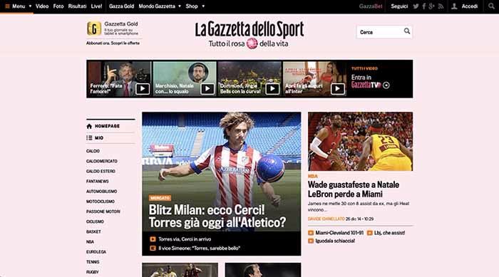
La Gazzetta dello Sport: redesign of the website
La Gazzetta dello Sport is the most widely read sports daily in Italy. In February 2014 its online version underwent a radical change. Among the changes made, we highlight:
- the hierarchy of information
- the readability of the articles
- the coherence between the offline and online image of the magazine
- the adaptability of the site according to the devices to which it is accessed
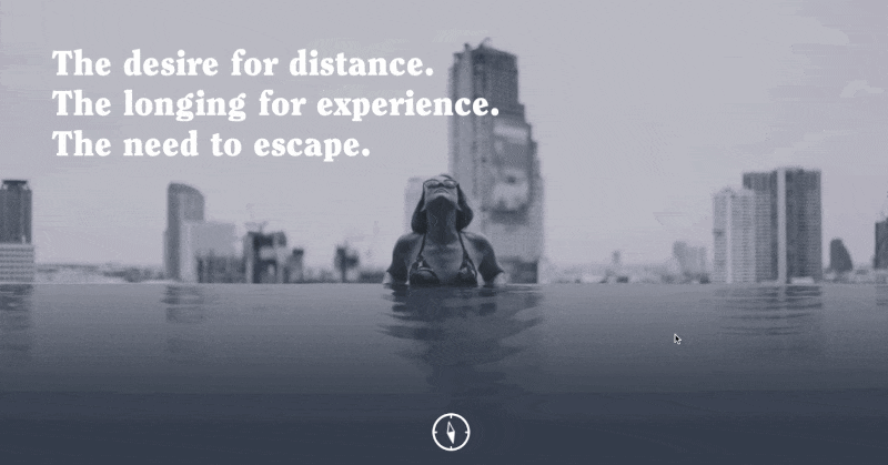
The Fernway: landing page
The Fernway is a startup that offers travel experiences. Its website is a landing page as a ‘coming soon page’, in fact The Fernway is not yet offering its services and will be launched in January 2015. The website leaves us curious to know more about the company and invites us to leave our email address, temporarily using it as a marketing tool to collect subscribers. The initial screen is one of the most charming combinations of letters and videos we have seen for some time.
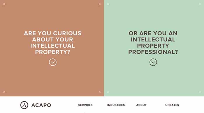
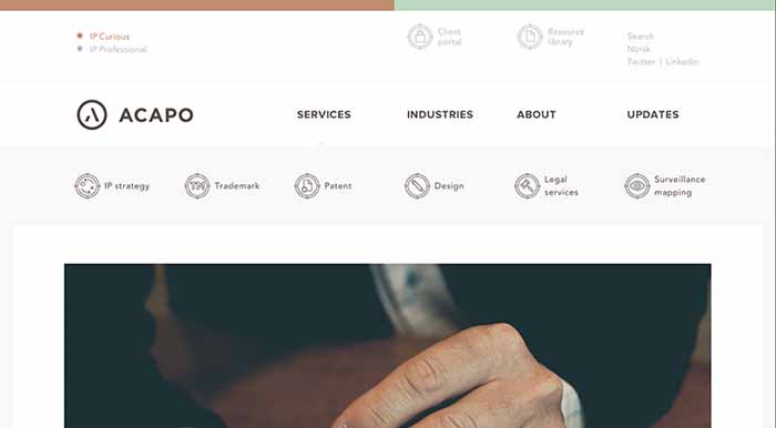
Acapo: corporate web services
Acapo is a Norwegian patent and intellectual property consultancy, services that do not stand out to give space to the creativity of a web designer. But in this case we find a website with numerous strengths:
- an initial screen that distinguishes between the two potential clients of the consultancy, a very original solution
- a set of typographies and iconography that present the content in a very clear and entertaining way.
- a very intuitive and usable navigation menu
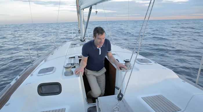
Sortie en mer: a unique web experience
A website is not only a sales tool, it can also be a multimedia and artistic object that can give us unique sensations: this is the case of Sortie en mer, a French project of great visual impact. We don’t want to give away too much information. The best thing to do is to go directly to the site and live the adventure.
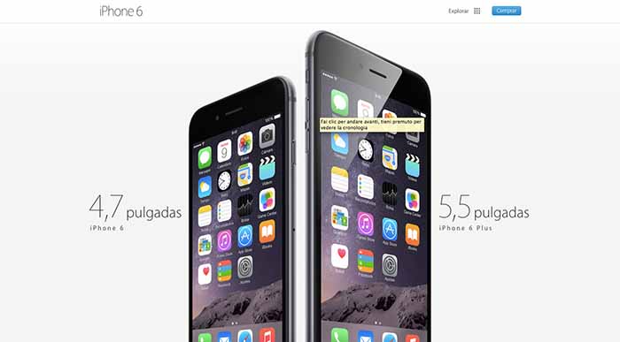
Apple Iphone 6: product page
Apple’s iPhone 6 page can’t be missing in our ranking: a product page that at first glance may seem simple, but is actually a very well calibrated combination of product presentation images, white space and lettering.
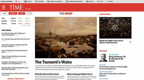
Time Magazine: web redesign
Another considerable web redesign this year was that of Time magazine. Thanks to a very balanced and elegant typographic set, it is truly a pleasure to read Time’s articles. But there are two features that also stand out on this site:
- the side menu always visible on the right side of the screen, with all the articles that are being published: a UI pattern that we will surely see in many other websites.
- AJAX loading of the articles, i.e. when the end of the article is reached, the next article is automatically loaded.
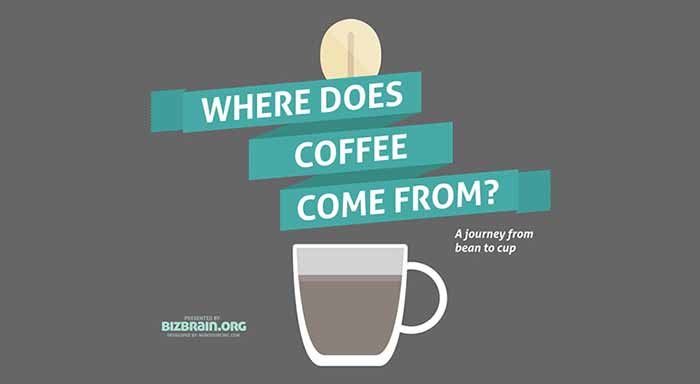
Where does coffee come from: an interactive infographic
At Reinicia we love infographics and coffee [also cola cao]. On this website we have both. An interactive infographic like this one can be a very powerful tool to generate viral content and tell stories in an entertaining way. In recent years, infographics have become one of the most effective marketing tools to promote a brand. And we believe that interactivity and length will mark 2015.
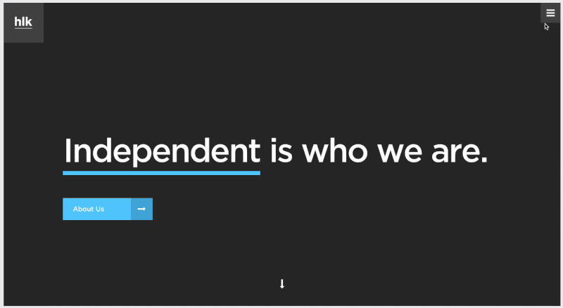
hlkagency: corporate content website
In this media agency they know how to present information in an alternative way: the image is the queen of the screen while the navigation is extraordinarily fluid. But what leaves us with our mouths open is the navigation menu: a hamburger-style menu that unfolds and shows us the different “items” of the same with moving images; by hovering over each “item” we can see a video loop. An effect that will surely be a trend for 2015.
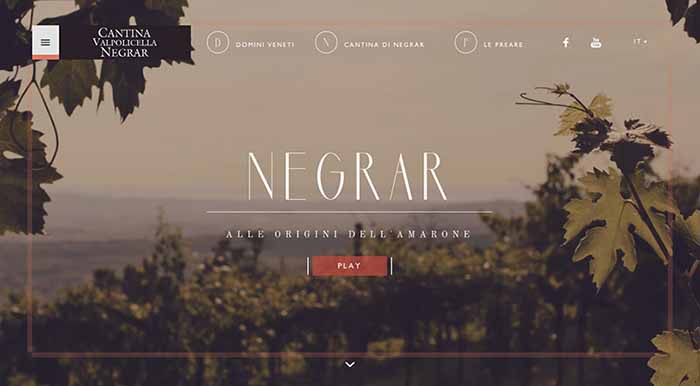
Cantina Negrar: corporate web of products
Italians do it better, in this case wine. In this website we literally enter into the secrets of Italian wine. A intelligent use of images, typographies and shapes communicates the art and nobility of wine production. The video on the cover is very well made: in fact a video on the products is a good tool to communicate your services or products and clearly improves the conversion rates on the web.
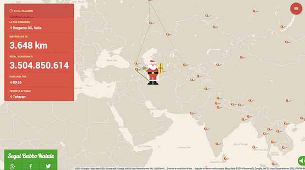
Santa Claus Tracker: Google experiment
We end this review by mentioning Google’s extraordinary creative team. In this case they have been able to track Santa Claus himself in the action of distributing his gifts.